Qudo
Qudo™
Qudo’s mission is to make babies lives brighter by tackling the problem of persistent crying and colic.
Every parent wants to give their children the very best start in life — so they are healthy and happy. But persistent crying or colic can have a big impact, making babies miserable and parents stressed. Qudo believe that science can create solutions that care for both.
Qudo Soother™
Qudo's patented soother has a uniquely designed teat that mimics sucking on a finger. The teat shape, angle and density is formulated to softly rest on a baby’s upper palate to naturally relieve strains and structural tensions. The unique Qudo Soother™ design can enhance an infants cranial rhythm, resetting and improving biological and physiological mechanisms. This helps to naturally release tensions within their body and reduces discomfort.
Powell Allen was asked to create a positioning and identity that enabled Qudo, especially the Qudo Soother™, to standout in the crowded baby and pacifier market. Not an insignificant challenge, as there is often a stigma associated with the use of pacifiers in the UK.
We coined the brand idea — Soothing Science™
Soothing Science™ brings the science to the fore — and separates Qudo from the competition. It emphasises the caring nature of the business; it emphasises the results of what they do; it allows Qudo to speak to both parents and to medical professionals; and it is both practical and emotional.
The identity incorporates a soother with the letter Q and embodies a target.
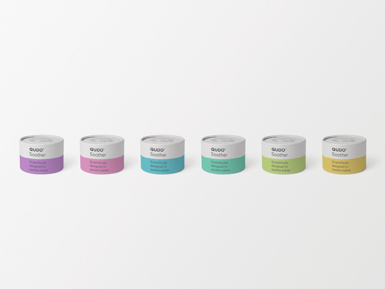
To support the desire to be a gender neutral brand, the visual language uses colour in a flexible and bold manner. It also uses language in a bold manner to educate, place an emphasis on science and help dispel the stigma associated with dummies.
Positioning | Identity | Visual System | Ads