Chic Retreats
Chic Retreats is a travel lifestyle brand dedicated to uncovering exceptional hotels around the world. They believe that what makes a hotel special is not its stars or rosettes, or whether there is a mini bar in the room, but the passionate people behind it, its unique concept and the lasting memories it creates.
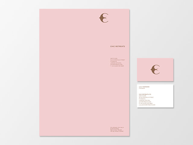
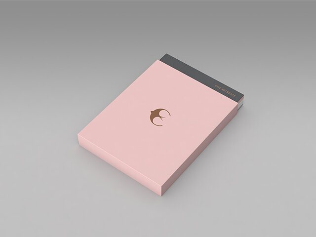
Powell Allen were tasked to encapsulate Chic Retreats' core belief and create a new luxurious brand identity and visual system.
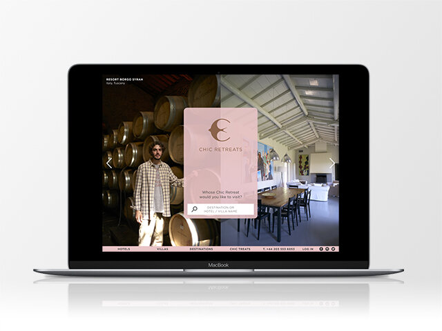
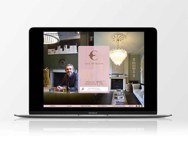
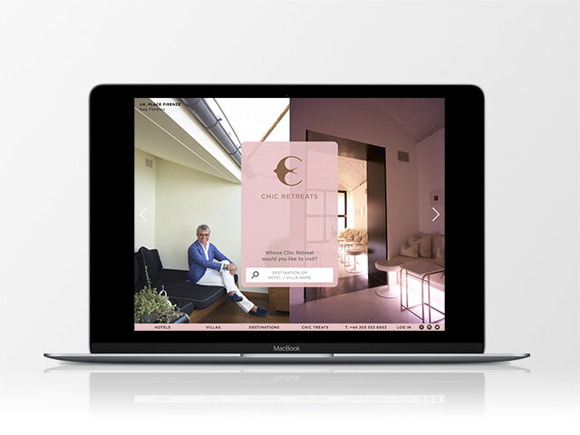
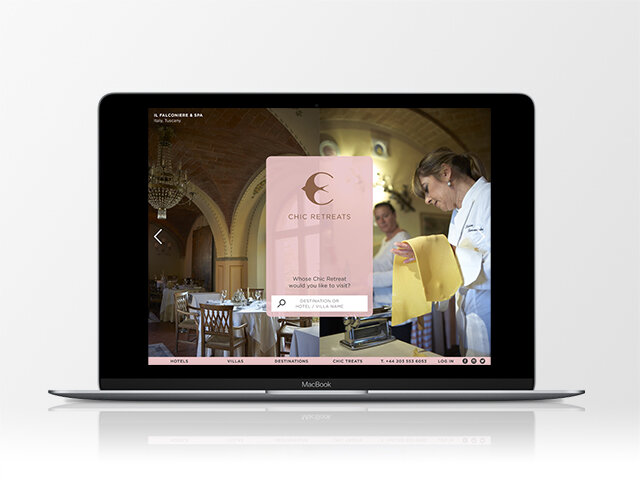
The symbol that we crafted incorporates a swallow with the letter C. The swallow represents travel — a migrating bird that has a worldwide cosmopolitan distribution on every continent except Antarctica. Swallows are a symbol of good luck and a sure sign that summer is on its way. The symbol is used as a badge of belonging for all of the boutique hotel members and also endorses Chic Retreat lifestyle brands.
The website in an antidote to bland hotel booking engines and generic travel sites. It showcases member owners (photographed by Julian Anderson) paired with their hotel in a distinctive split screen format — supported by their inspiring stories and insight into hidden places that only locals know about.
Brand Identity | Communications | Website